The hardest part of image conversion is usually not converting the file. It is deciding how aggressive the compression should be before you see the result. A preset only helps if it maps cleanly to the tradeoff you are actually making. Otherwise it is just another vague label standing between the input and the output.
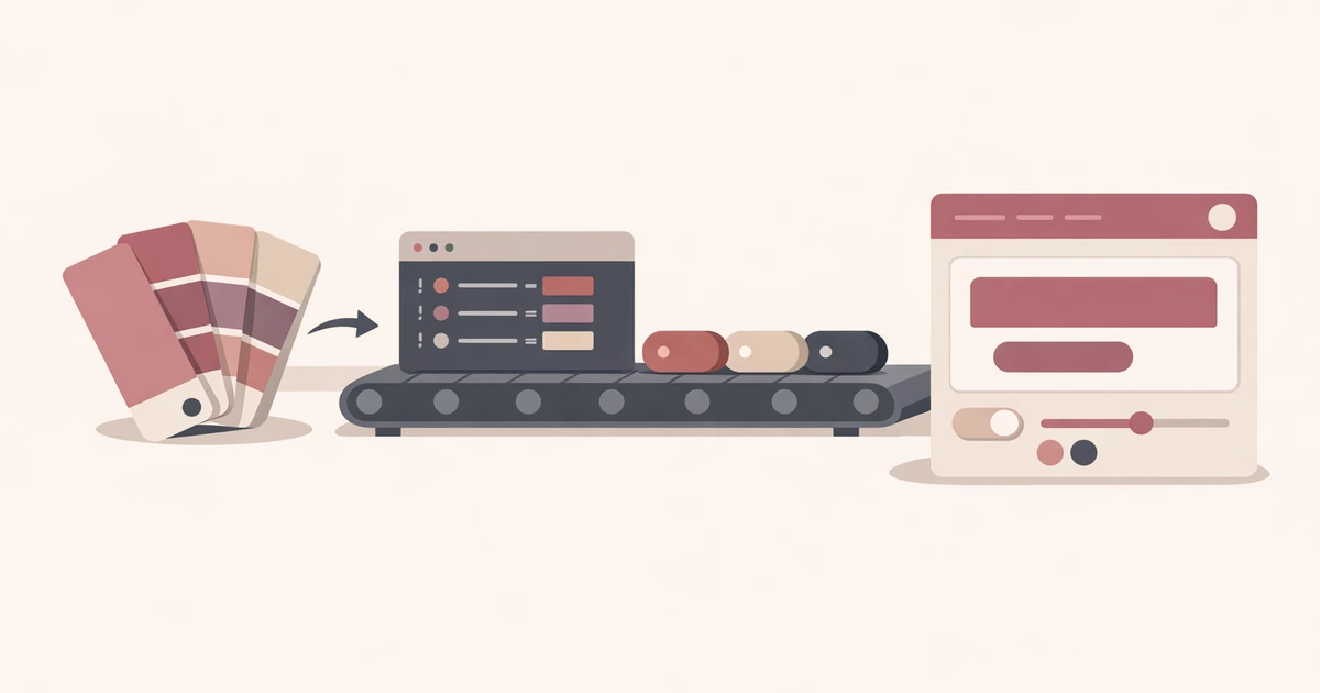
That is why Converty's WebP Converter uses three presets instead of a slider full of pseudo-precision. The real decision is straightforward: do you care most about fidelity, the default middle ground, or the smallest possible download? In the code, those presets map to distinct quality targets rather than fuzzy marketing language: High uses 0.92, Balanced uses 0.82, and Smallest uses 0.70. That is useful because it means the names correspond to a real change in output behavior.
The important part is knowing when each preset fits the asset set in front of you.
Start with the asset type, not with the preset name
Most image batches are mixed in purpose even when they arrive together. A screenshot for docs, a hero photo for a landing page, and a flat product illustration may all be in the same folder, but they should not be judged the same way.
That is why the easiest way to choose a preset is to classify the files by what the reader will notice first. If the audience will notice fine detail, crisp edges, or text clarity before they notice the file size, bias toward fidelity. If the image is mostly contextual and the main job is to reduce weight for the web, you can compress harder.
Preset choice becomes much simpler once you stop asking which option is "best" and start asking which loss is acceptable for this batch.
Use High when visible detail matters more than aggressive savings
High is the right choice when the image is expected to stay sharp under inspection. Product screenshots, UI captures with small text, diagrams, and polished marketing assets all tend to benefit from the lightest compression. You are trading away some size savings in exchange for fewer visible compromises.
This is especially relevant for screenshots used in docs or onboarding. Readers may zoom, crop, or focus on interface details. A fuzzy screenshot is not just aesthetically weaker. It can make the documentation harder to use. In those cases, the correct question is not whether High saves enough bytes to win a benchmark. The correct question is whether the output still protects the visual cues the reader depends on.
That is why High often makes sense for software teams publishing product walkthroughs, release notes, or help content. The image is there to communicate information, not just to decorate the page.
Balanced should be the default for mixed web content
Balanced is the preset most teams should start with for ordinary website assets. It gives you a cleaner tradeoff between clarity and compression without forcing a more opinionated choice too early. In practical terms, it is the best starting point for mixed batches of UI screenshots, marketing images, and product-support visuals where you want decent savings without spending the morning auditing every file.
This is why the current tool copy recommends it for most images. It is not the mathematically perfect preset for every case. It is the one most likely to get you to a useful answer quickly.
For a real workflow, imagine a launch page that needs six product screenshots, two editorial photos, and a handful of secondary illustrations. Balanced is the fastest way to convert the whole set, review the size deltas, and decide whether any specific file should be rerun at High or pushed further toward Smallest. You make one good default choice first, then only revisit the outliers.
That is also where Converty's batch flow helps. You are not choosing a preset in the abstract. You are choosing it and immediately seeing which results came out smaller, which remained visually solid, and which deserve a second pass.
Use Smallest when the download budget matters more than fine detail
Smallest is the practical choice when the asset is supportive rather than scrutinized. If the image exists to provide context, not to survive close inspection, heavier compression is often the better call. This is common in supporting blog graphics, lower-priority marketing art, or batches prepared mainly to cut transfer weight.
That does not mean Smallest is a throwaway mode. It means you should use it intentionally. If the files are background illustrations, secondary visuals, or utility graphics that mainly need to stay light, the most aggressive preset usually matches the goal better than a fidelity-first one.
The mistake is applying Smallest automatically to text-heavy screenshots or dense interface captures. Compression artifacts on those images make the content feel cheaper faster than the byte savings justify. That is exactly the kind of mismatch a good preset system is supposed to prevent.
A realistic batch workflow is more useful than a theoretical answer
Suppose you are preparing a documentation update and a marketing post on the same day. You have product screenshots with interface text, a few cropped photos, and some supporting visuals from design. The batch is real, messy, and not cleanly sorted by content type.
The fastest workflow is:
- Run the whole batch through WebP Converter with
Balanced. - Review the size deltas and the visual output.
- Re-run the text-heavy or high-value screenshots with
High. - Re-run purely supportive or decorative assets with
Smallestif the first pass still feels heavier than necessary.
That workflow matters because it mirrors how teams actually work. Nobody wants to tune every image individually before seeing what the defaults do. A good preset strategy should remove decisions from the common path, not create more of them.
If the file-size result itself is part of the decision, pair this article with Why a WebP File Can Be Larger Than the Original. It explains why even a correct conversion can sometimes fail the "smaller file" expectation and what to do next.
The right preset is the one that shortens review, not the one that sounds impressive
Preset language often becomes unhelpful because it is written as if compression were only a quality contest. In reality, the useful preset is the one that reduces rework. High protects detail when detail is the point. Balanced gives you the best default for mixed website work. Smallest earns its place when download weight matters more than visual nuance.
That is also why the current broader guide, How to Convert PNG and JPG to WebP Without Extra Software, remains useful. It covers the full batch workflow. This article is narrower on purpose. It tells you how to make the one decision that most affects whether the batch feels right when it is done.
Choose once, review quickly, then move on
Good conversion tooling should help you choose a preset once, review the results fast, and only make a second decision when the files demand it. That is what makes presets useful. They are not supposed to simulate total control. They are supposed to eliminate unnecessary hesitation.
Start with the WebP Converter when you need the direct tool, use the FAQs for the handling and batch details, read How to Convert PNG and JPG to WebP Without Extra Software for the full guide, and keep Why a WebP File Can Be Larger Than the Original nearby when the next question is not "which preset?" but "why didn't this get smaller?"